Fintech Brand Identity & Mobile App Design
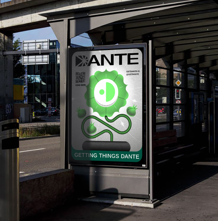
GETTING THINGS DANTE
“DANTE’S standout feature is its game-changing nature. The service’s feature set is unique, so its fintech brand identity must differ significantly from the styles of other financial services and transcend the aesthetic norms of this category. The service is launching simultaneously in cultures with diverse characteristics, which was a determining factor in choosing a symbol that holds positive connotations across all cultures, serving as a foundation for the corporate branding.”
DANTE’s standout feature is its game-changing nature. The service's feature set is unique, so its identity must differ significantly from the styles of other financial services and transcend the aesthetic norms of this category.
The service is launching simultaneously in countries with diverse cultural characteristics, which was a determining factor in choosing a symbol that holds positive connotations across all cultures.

The Challenge: Fintech App UI/UX & Identity
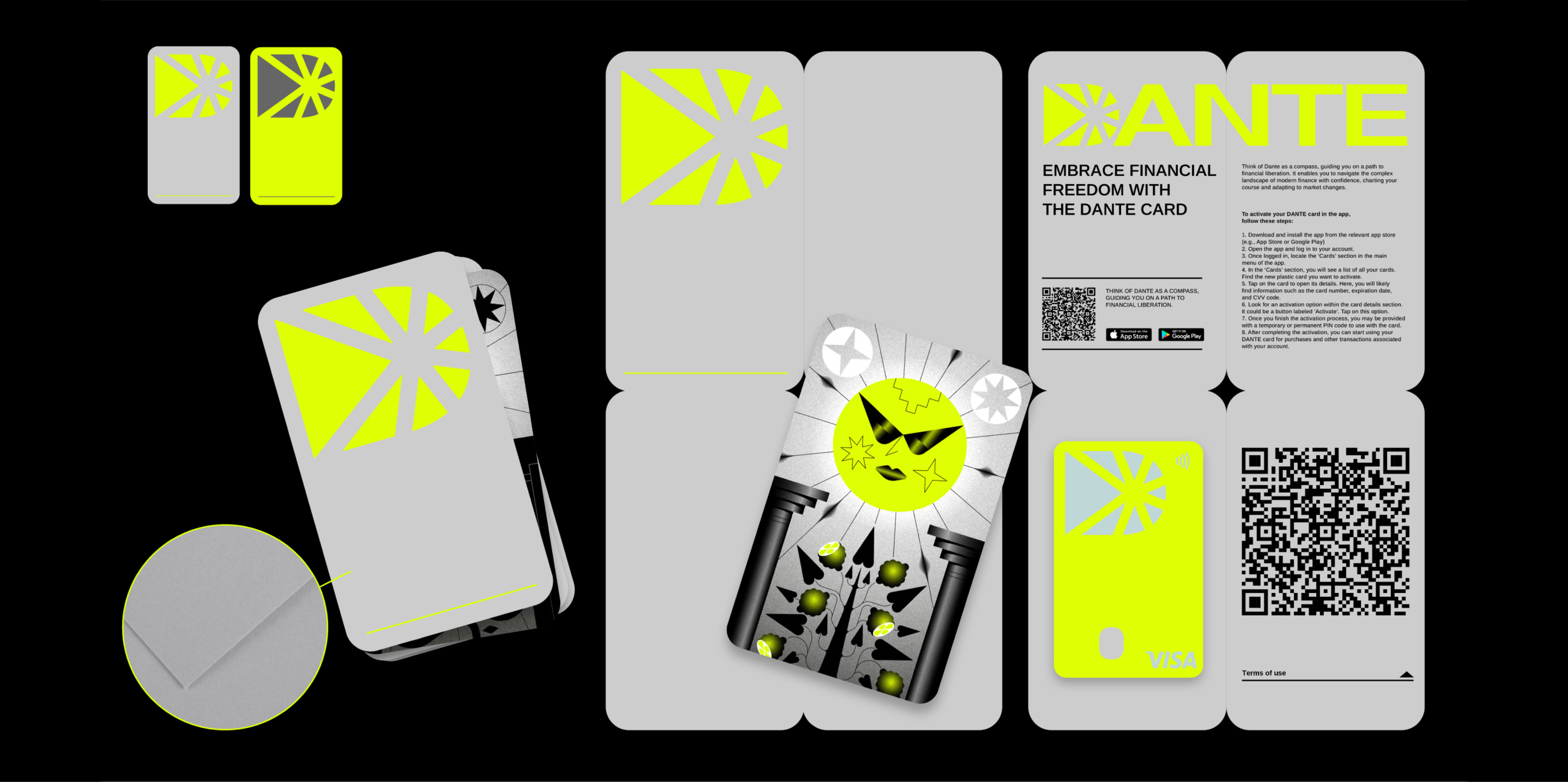
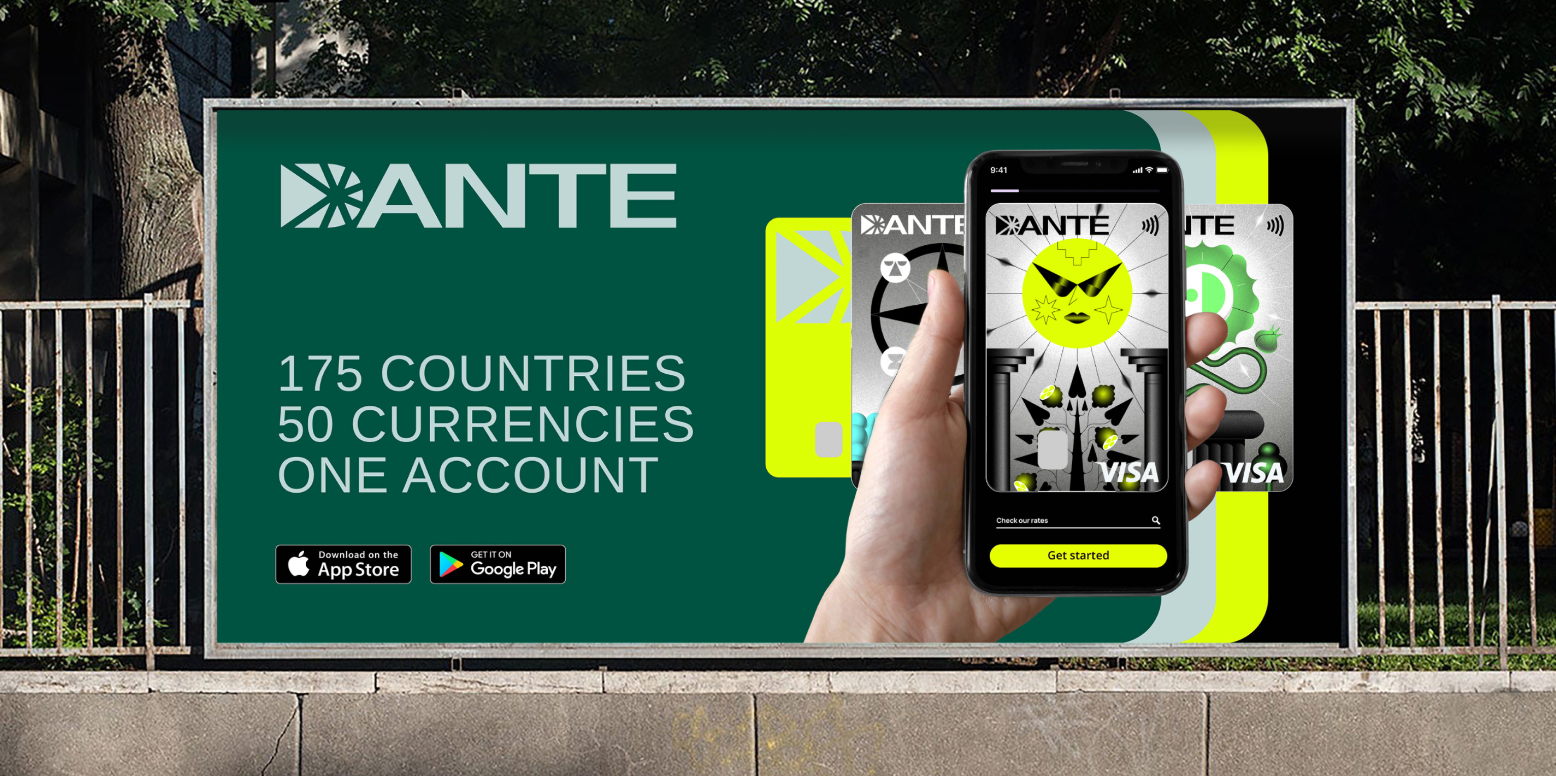
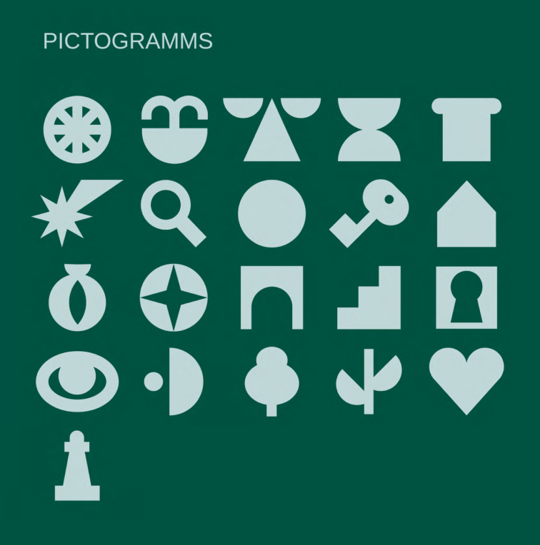
“The key touchpoints of the service with the audience are the mobile app interface and the plastic bank card. Therefore, it was important to develop a symbol that would serve as a recognizable icon, a strong visual identity, and simultaneously be the first letter of the brand’s name. We were tasked with creating custom illustrations referencing the symbolism of tarot cards to enhance the overall UI/UX design.”
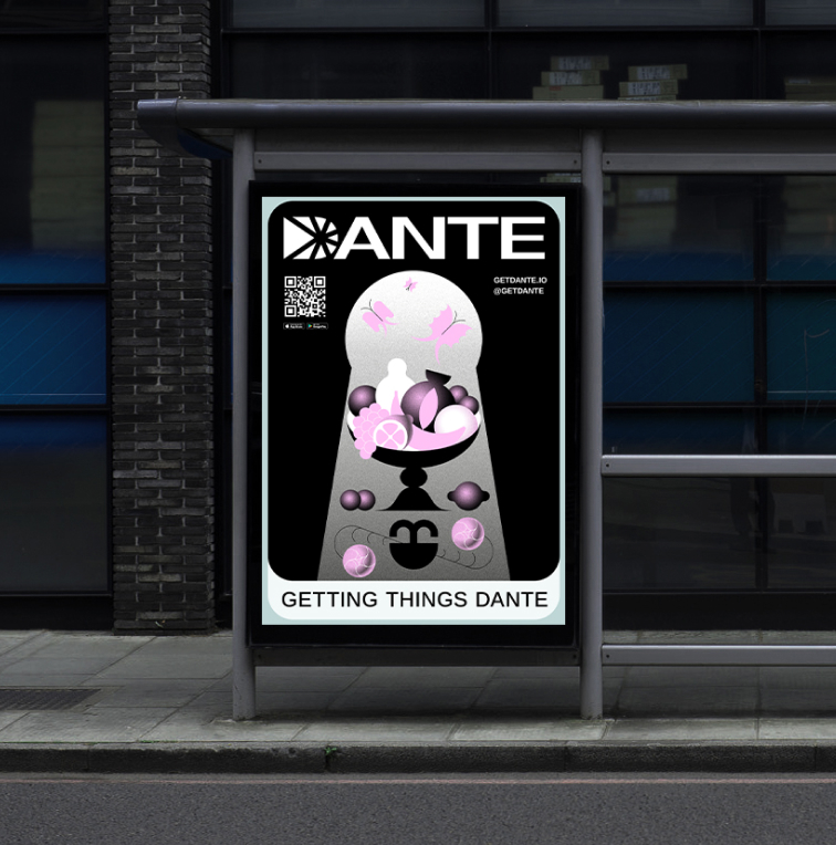

The Solution: Distinctive Corporate Branding
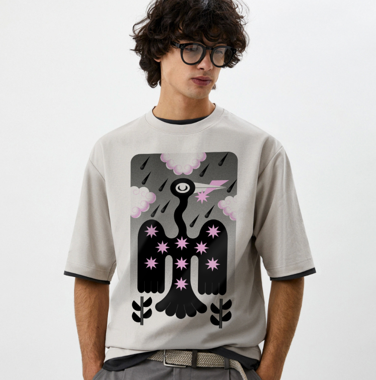
“The corporate identity of this vibrant project is infused with symbols from various fields. Our brand strategy involved comparing the bank card to a card of fate drawn from the tarot deck, continuing the narrative of choosing a path. The color palette supports the chosen theme: Vibrant lemon yellow ‘illuminates’ the way, complemented by subdued and tonally contrasting colors. Users can choose between the custom illustrations for their plastic card.”